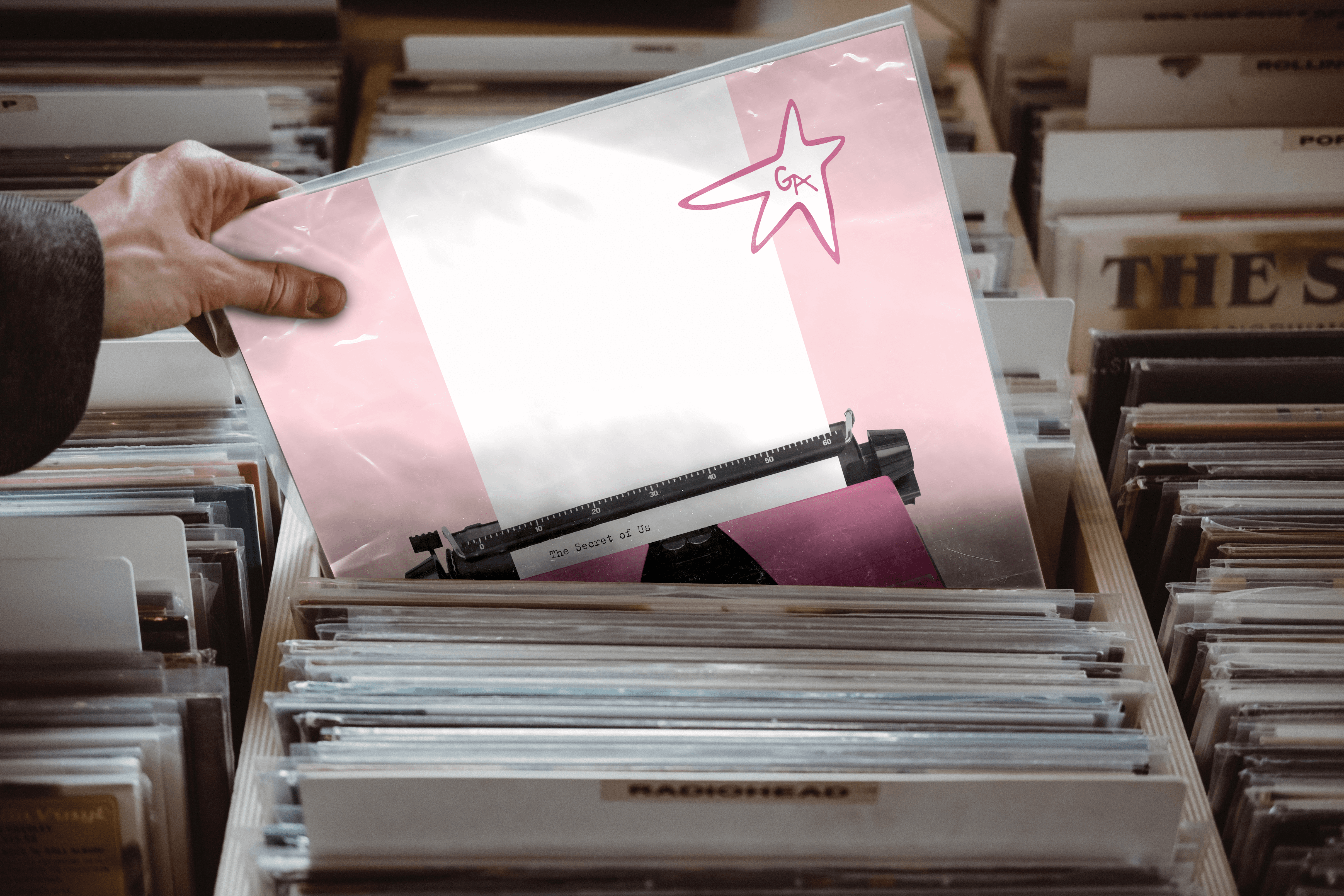
The Secret of Us album redesign

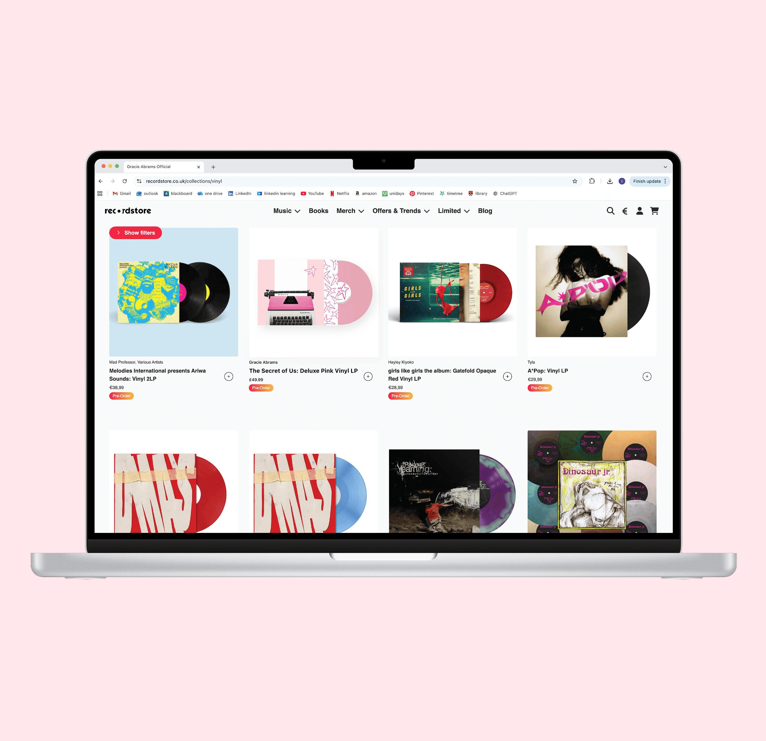
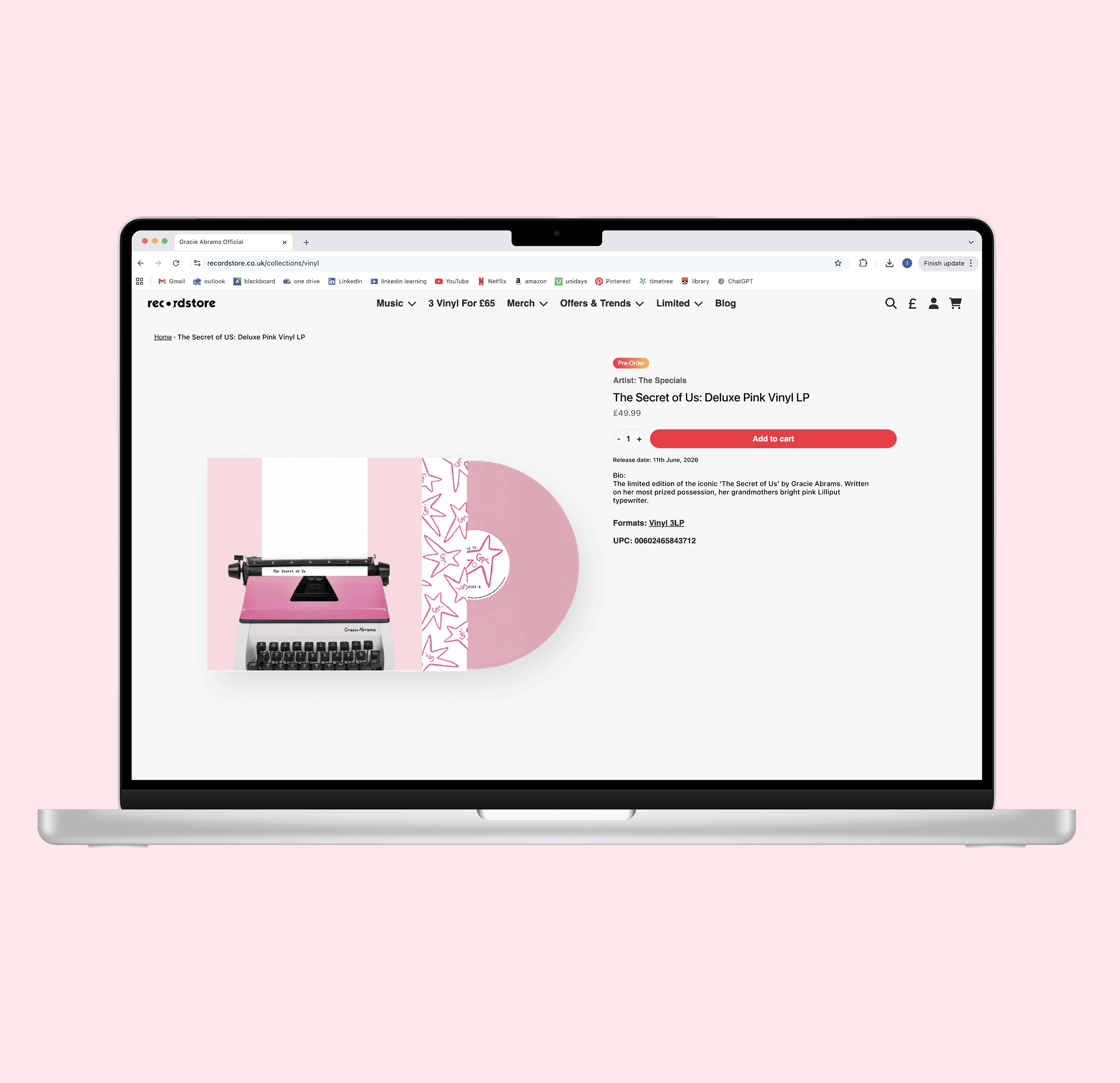
In this project I set out to redesign Gracie Abrams 'The Secret of Us' deluxe album cover, releasing a limited edition LP, matching cassette tape and a ticket and merchandise website.

Duration

5 weeks

Client

Student project

Year

2025/26

Deliverables

Record + inner sleeve, cassette & website

Overview

This project brief outlined a redesign for a re-launch of an existing product, with the aim of creating a versatile identity that would be translated across multiple formats. Each deliverables was designed to work individually while also forming part of a cohesive series. The Secret of Us existing packaging – a photo of Gracie Abrams and the LPs title placed above her head – felt unrepresentative of the albums emotional post breakup music. 

Research
Defining the album 

The Secret of Us is Abram’s second studio album, released in June 2024 and while primarily sits in the genre of pop, the albums explores elements of indie pop, folk pop, bedroom pop and indie folk. While the main theme centres on post breakup emotions, the album dives into a deeper feeling of being a secret, exploring the grief of being a secret love. 


Visual analysis 

As part of my research for this project, I conducted a visual analysis of both the standard and deluxe editions of the album, focusing on areas where the existing design felt disconnected from or unrepresentative of the music and themes within.

The main design issue I identified was that the visual identity did not strongly communicate the album’s themes of heartbreak, post breakup emotions and the feeling of being someone’s secret. Instead, the close up photography of Gracie, combined with the bright colour palette and playful typography created connotations of happiness. This felt at odds with the more vulnerable and emotionally complex themes explored throughout the album which created an opportunity to explore an identity that better reflected its narrative and emotional depth. 


Genre, target audience & comparators 

While exploring the wider pop music genre, I examined artists and albums in the industry that also released albums affiliated with heartbreak and post breakup emotions. Using platforms such as Spotify and Apple Music, I analysed the visual language commonly used across the genre. I found that pop albums rely on vibrant colour palettes, expressive photography and occasionally bold typography. While the existing design fits comfortably within the pop genre, the target audience isn’t reflected.  

Design process
Sketches

I began the design process with sketches, taking direct inspiration from Gracies lyrics, music videos and the moodboard created for this project. I explored three different design directions, focusing on photography, materiality and typography. Gracie Abrams was known for releasing albums in a strategic way, often teasing them in singles music video with hidden ‘easter eggs’, inspiring me to incorporate this into my redesign. While the majority of my concepts played into the idea of secrecy, I also played close attention to materiality, and began to make physical three dimensional mockups early on in the design process. 


Photoshoot

The breakthrough was the idea of a typewriter. Using typewriters from the Department of Typography and Graphic Communication at the University of Reading, I was able to set up a photoshoot, taking photos of multiple typewriters, all at different angles. Using a head on photo of 1970’s Lilliput typewriter, edited in Photoshop I was able to create the base of my redesign. 


Typography

Due to the nature of my redesign, I used a typewriter script typeface throughout all deliverables, maintaining consistency between size and weight to make the journey between each product feel more connected. I incorporated a second handwritten typeface on the physical typewriter, which was rendered and positioned to fit at a slight angle. All secondary text – credits, small print and barcode – have been typeset in Sweet Sans pro, a neutral sans serif. 


Materiality 

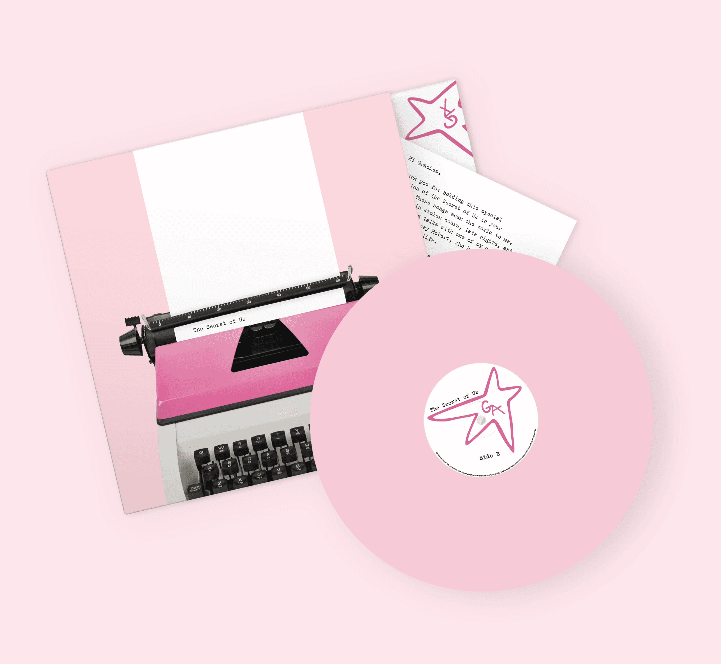
To make the LP feel more tactile and engaging, I designed the typewriter paper to physical extrude from the typewriter, continuing across the front of the LP and bending over onto the back. The physical LP was made out of packaging card, while the typewriter paper was printed onto a lightweight 120gsm ‘Snow White’ stock from KeayKolour. Selecting the appropriate materials was an important part in the making process, particularly due to the intricate construction of the LP. For example, I chose packaging card over 300gsm paper to allow for a sturdier finish.

The outcome
Consistency between deliverables 

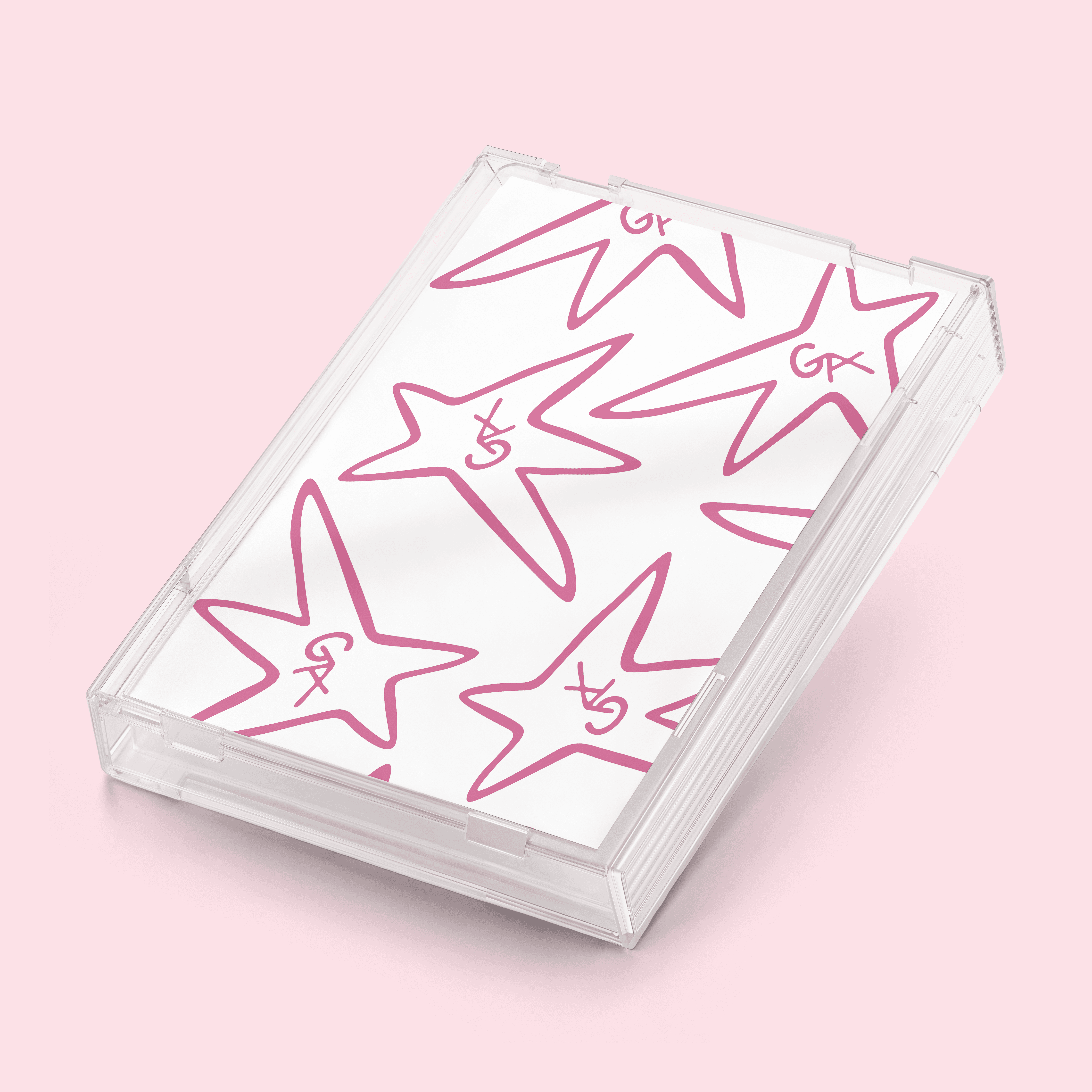
While the main deliverable for this project was the LP, all three play a part in storytelling. Inside the LP, a secret note (which has been typed on the typewriter) is placed between the inner and outer sleeve and states to look for the hidden message in the cassette tape. The second deliverable holds a cassette tape, in which a secret envelope encodes a seven digit number that allows access to the exclusive ticketing and merchandise website. 

The main design consistency is the well known Gracie Abrams star logo, the star was colour matched to the pink vinyl and placed across all three deliverables. While the other consistency’s lay between the colour of the physical vinyl and the typefaces used throughout. 


The outcome

A re-design of Gracie Abrams album The Secret of Us with accompanying cassette tape and exclusive website. This concept emphasises the Secret behind the album, allowing the fans to unite all three deliverables with a personalised note from Gracie herself, leading listeners through the record and cassette tape into the exclusive ticketing page for first access to The Secret of Us tour. The record itself showcases the typewriter paper to extruding onto the back of the record, exampling high level materiality and crafting, awarding me an Examiners' Award for excellent work.