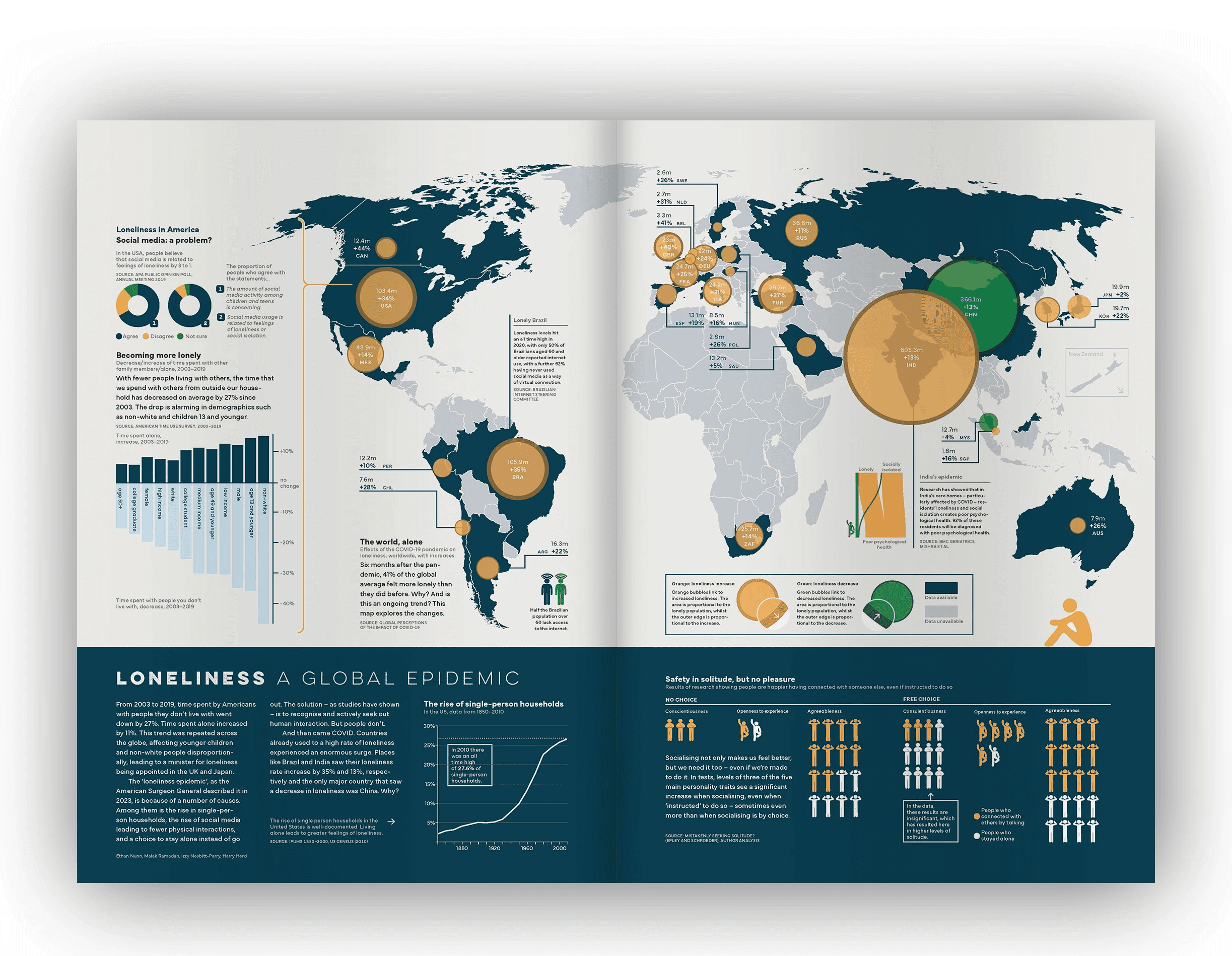
Loneliness: a global epidemic
In this group project, we were tasked with designing a magazine spread and supporting animated social media asset that addressed a rising social issue. Our project specifically focused on loneliness and social isolation.
Duration
6 weeks
Client
Student project
Year
2025
Deliverables
Infographic double page spread

Overview
Using information–led design, we created a double page magazine spread supported by animated social media assets. Working collaboratively, we explored the growing rise of loneliness and social isolation, using data visualisation to raise awareness and communicate the issue in an engaging and accessible way.
Research
Initial research
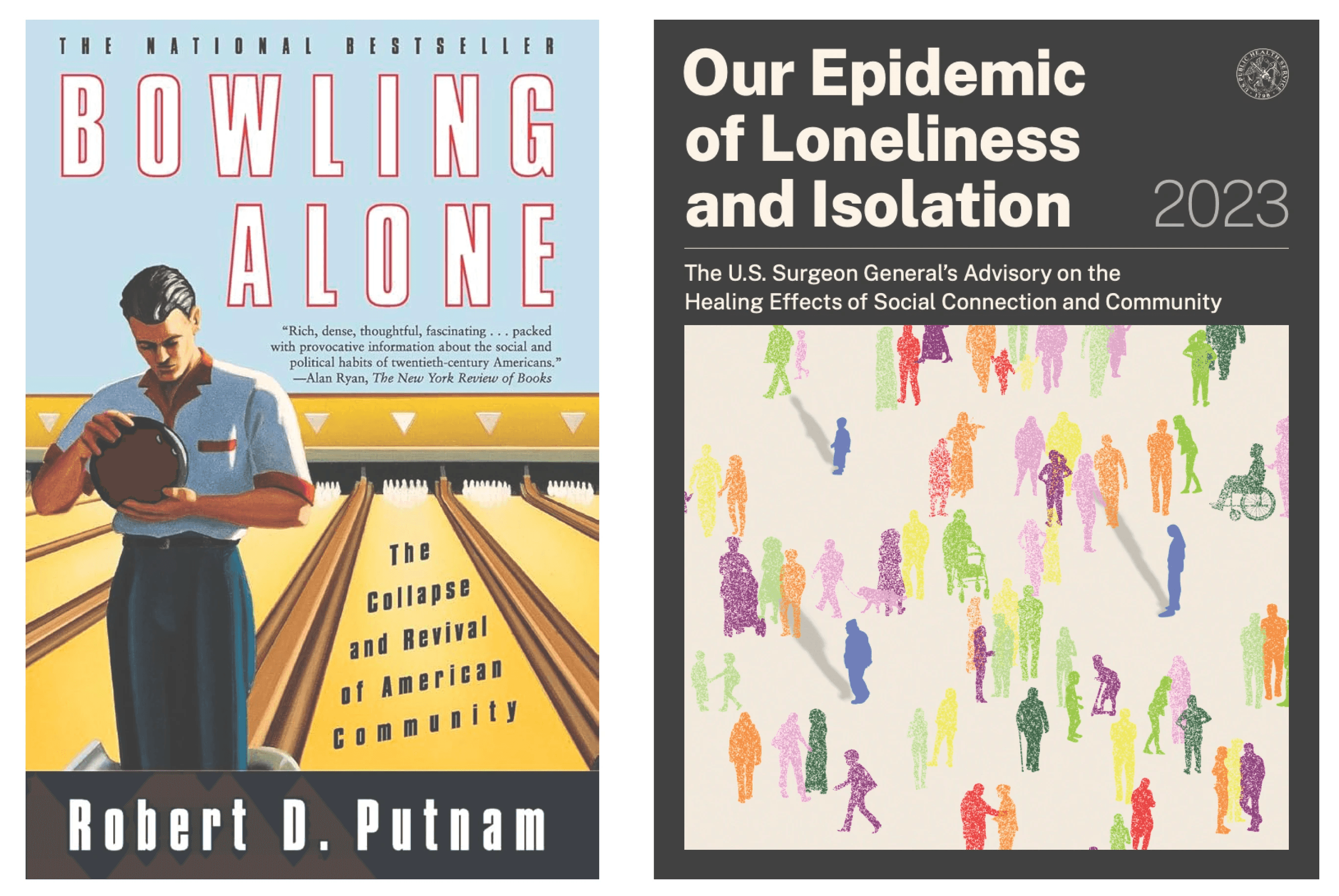
As a group, we explored a range of different ideas before focusing on social isolation and the growing concern surrounding loneliness. In 2023 the American Surgeon General wrote a foreword to a report explaining that loneliness is an epidemic, at risk of tearing apart America’s social cohesion. As we developed our research, we discovered that this concern extended beyond America and were also evident across many Western countries.
Another particularly interesting source was Robert D. Putnam’s Bowling Alone: America’s Declining Social Capital, which argues that American’s became increasingly disconnected from those around them during the latter half of the twentieth century. Putnam highlights how, despite an increase in bowling overall, participation in blowing leagues has declined significantly. His argument extends far beyond bowling, and showcases the wider illustration of high demand for takeaways instead of eating in a restraint, and chasing to stream movies at home; eliminating the need for cinemas.
Data collection
Working with quantitative data presented a challenge, as large amounts of numerical information can be overwhelming. Creating a shared Excel spreadsheet, we collectively complied relevant datasets alongside links to their original sources, allowing us to organise information in one place and highlight the statistics that we felt were most relevant.

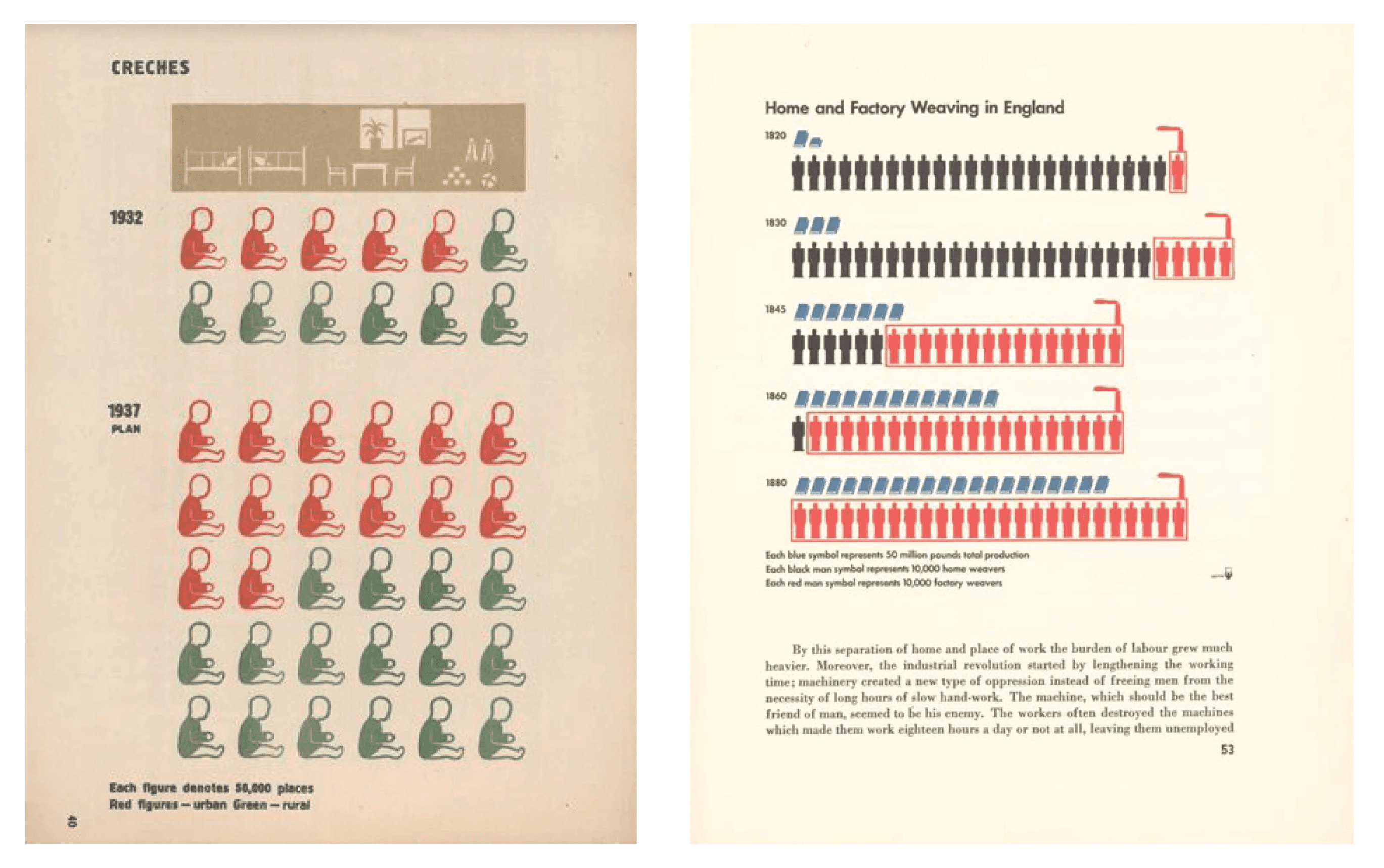
Otto Neurath
At the beginning of this project we attended a lecture discussing Otto Neurath and the development of Isotope graphs. While I found the lecture incredibly interesting overall, I was particularly drawn to Neurath’s aim of bringing ‘dead statistics to life’ by making them visually attractive and memorable. I was deep inspired by his work and wanted to integrate elements of it into our infographic concept. To further my research I explored World Imperialism, Isotope: design and contexts 1925-1971, which provided examples that influenced my sketches and design choices throughout the project.
Design process
Sketches
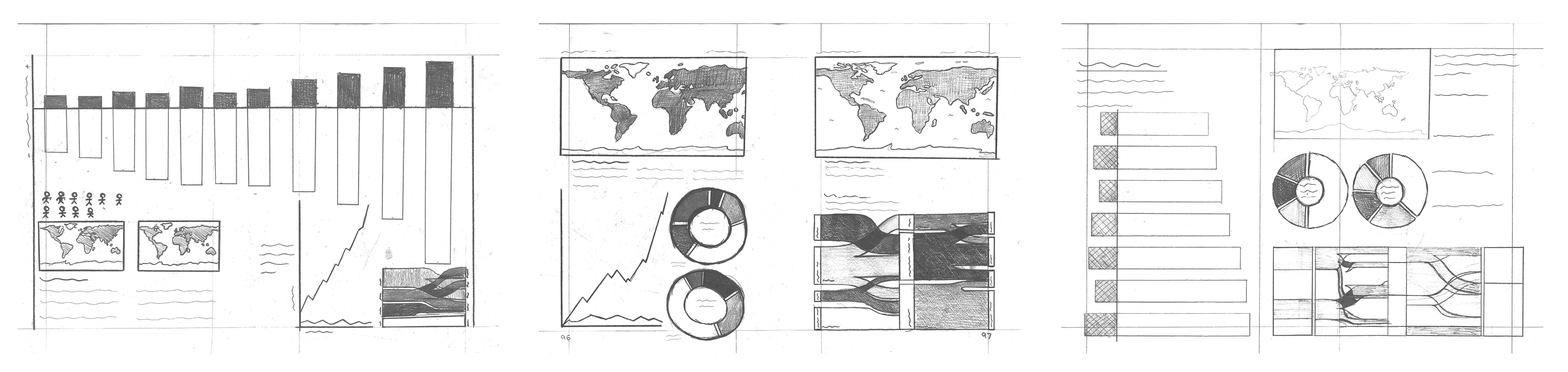
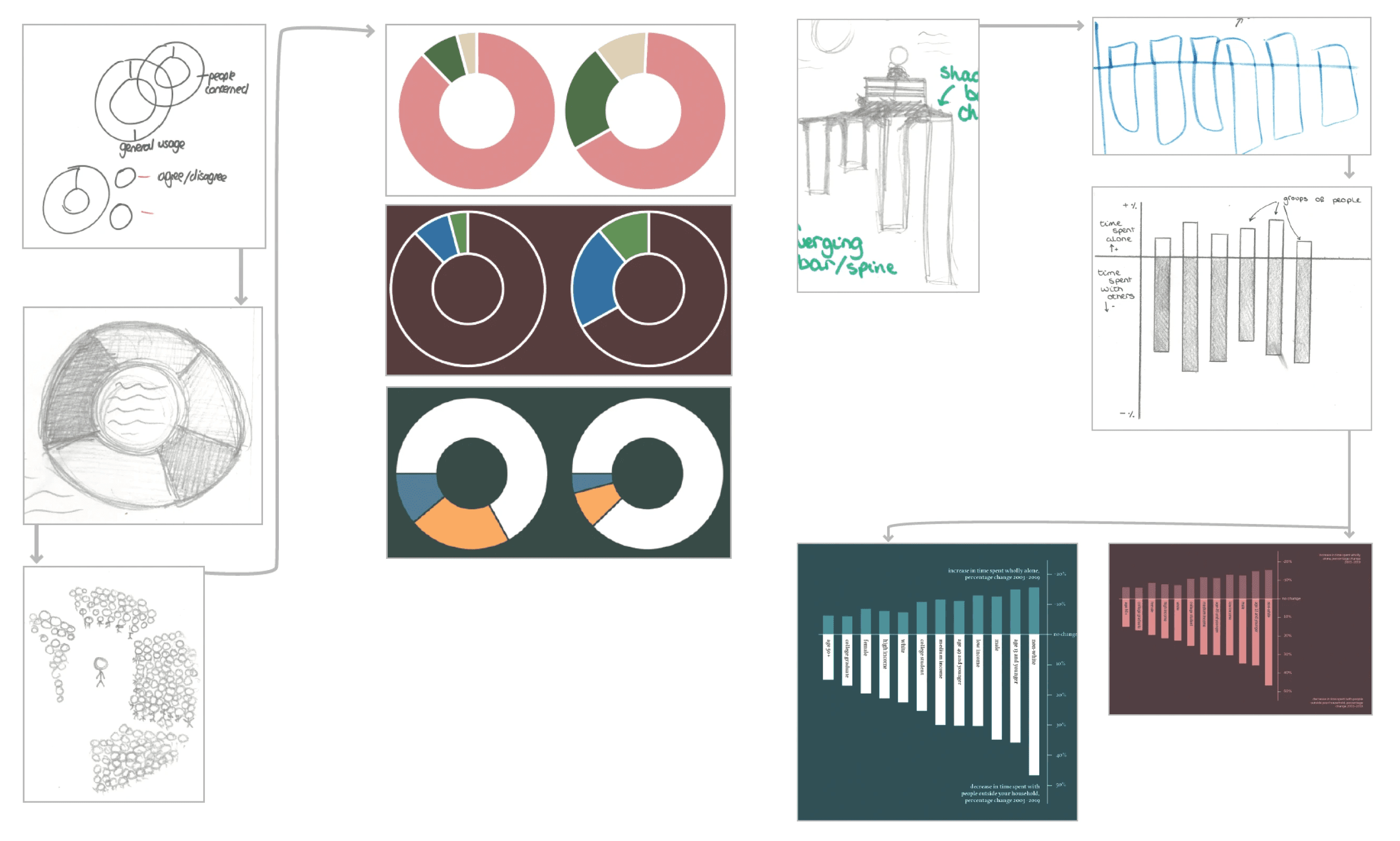
Our next step was to visualise the data out of excel spreadsheets, beginning with initial sketches. We explored visual systems that reflected themes of loneliness, incorporating connotations of darkness, sadness and isolation. We experimented with different approaches, including maps, donut charts and line graphs to determine the most effective way to communicate each dataset. Understanding visual hierarchy was also essential in guiding the reader through the infographic.
Sketches into digitisation
Moving our sketches into digital assets presented another challenge. To ensure the graphs worked effectively at scale, we developed three separate concepts and experimented with placing the individual graphs into different layouts. Doing this allowed us to test how each visualisation responded to the overall composition before developing the final design.
The outcome
Final feedback
Once we had agreed on a final design composition, we created one final sketch before digitising the design using our chosen colour scheme and typefaces. To ensure the outcome was as refined as possible, we went through multiple rounds of feedback, both internally within our group and externally with peers and tutors.
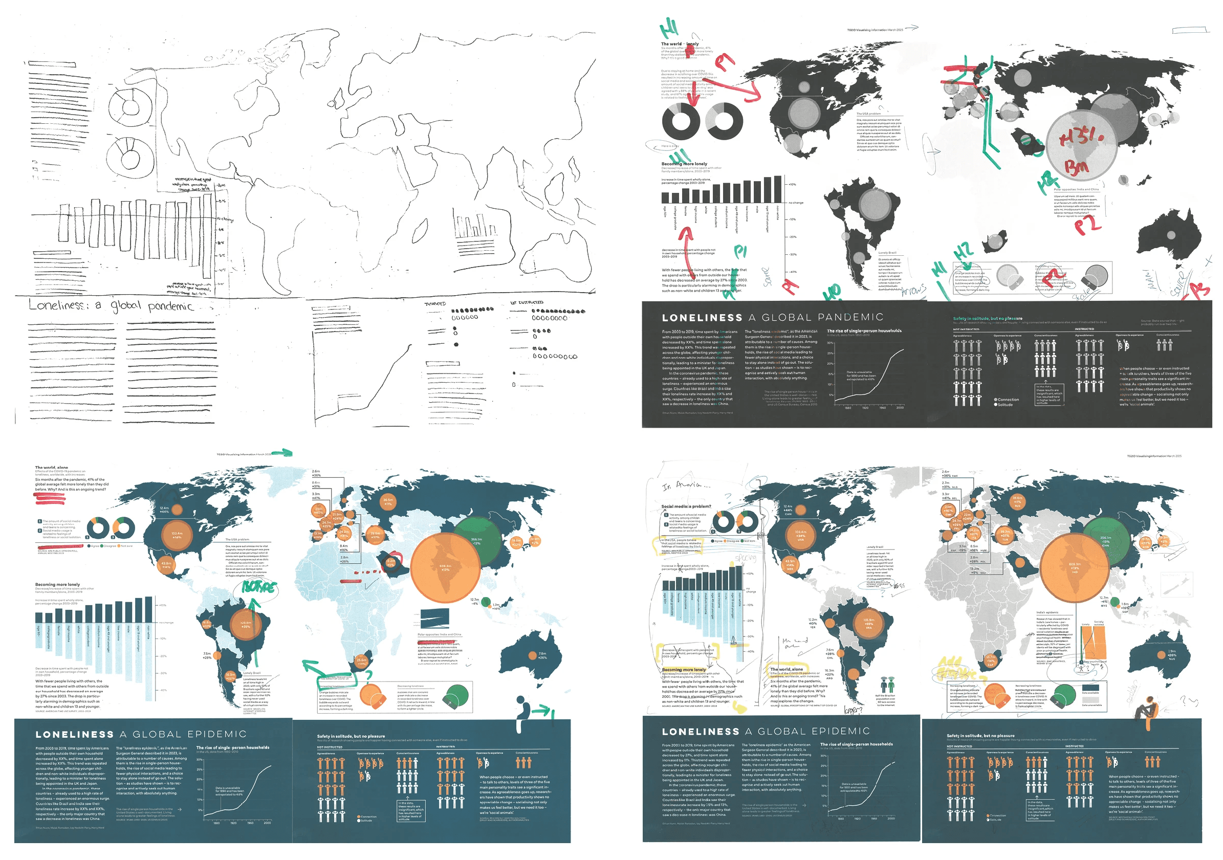
As a group, we were really proud of the final outcome, which successfully communicates the growing issue of social isolation through an engaging and accessible infographic. Individually, this project also helped me to develop my leadership skills and become more confident in voicing my options when I felt design decisions could be improved.